0
Started
Problem after update
Hi,
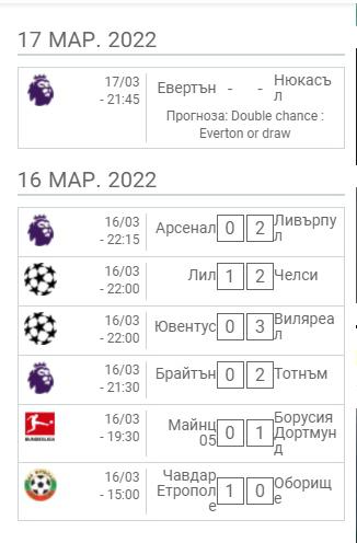
After the update my live block design has changed and i couldn't fixed it. Could you please help me?
See the image:

Customer support service by UserEcho

Hi
Send me a link to this page.
--
Best Regards
Andrei S.
Till now it looked pretty good. Basically there shouldn't be space between the competition logo and the starting hour and if its possible the names of the teams to be displayed under the logo with smaller letters.
It is possible. But you should add class to the wrapper to prevent CSS affect other parts of your site.
To do it just add to your shortcode class argument with any unique class, for example
Let me know when it will be done.
--
Best Regards
Andrei S.
I think you can try to use .widget-area-2 class. So class argument in shortcode not needed.
Add the CSS code
--
Best Regards
Andrei S.
Hi, looks fine, but could we remove the borders and center competition logo and date/hour? (if its possible only)
Hi again, as you can see, when there are games "live", the scoreboard doesn't look good at all.
Use the code
.widget-area-2 .match-list__live-time {
  display: block;
  margin-top: 5px;
  font-size: 13px
}

.widget-area-2 .match-list__live-block {
  min-width: 10px;
}

.widget-area-2 .match-list__live-status {
  margin-left: -5px !important;
  padding-right: 2px
}
--
Best Regards
Andrei S.